How many clicks does it take a new visitor to find what they need on your website? The #1 annoying feature of a website is improper or confusing navigation that leaves your user lost and wondering what to do next in order to find what they need.
Navigation is principal to the core usability of the site and is the primary communication vehicle (and hierarchy) of the site’s services, products, and solutions. Your navigation needs to be a reflection of what the site has to offer. Bottom line, if it isn’t in the navigation, then frankly - it just isn’t a priority to your business.
When it comes to conversion, traffic, and transaction metrics your navigation will help you meet goals or miss them. It’s important to consider user flow, best practices, and current trends when updating site navigation. Luckily, navigation changes can often be one of the easiest updates if done correctly.
eCommerce Navigation Best Practices
Generally, the best practice for eCommerce navigation is also specific to the page you are on and the device type on which it is used on. These both have implications for usability, conversion, and communication. Consider these examples:
- Specific navigation for specific pages
A product details page should lock a different header while scrolling, always keeping key tasks within striking distance (ie: product images, price, and add to cart button). In addition to the ability to easily add to cart, navigation for longer pages like product details should allow customers to jump ahead to key areas - specifications, reviews, product support, etc.
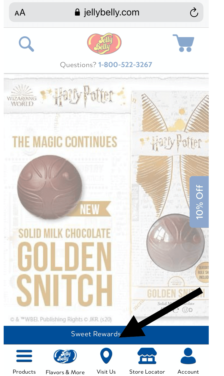
- Bottom trays in mobile navigation
A mobile navigation tactic that we have been introducing to our clients is utilizing a bottom tray. The bottom tray reduces the number of touches to task success for the user. Your bottom tray in mobile should identify the more important tasks, and they often can be different than what the desktop site navigation is. We do this because we are always striving to consider the user’s literal tactile abilities - and larger, the environment they are using the device type in. This makes sense because the user can touch these primary paths with their thumbs without having to move to the top navigation. It’s a subtle thing, but you can imagine that a grouping of these improved interactions makes for a better experience.
When designing your bottom tray, focus on the pages with the highest volume of queries when considering which buttons to add to desktop or mobile. That is exactly what we did for our client Jelly Belly, including a Store Locator and Visit Us button which are popular mobile user pages.
- Removing navigation at checkout
Echidna strongly recommends removing navigation in checkout. It has been demonstrated that checkout abandon rates can improve from this alone up to 13%. There are times when you want to lead or funnel customers to follow a discrete path. In checkout that means we are done upselling - it’s time to focus them into information input and conversion.
- Use descriptive navigation labels
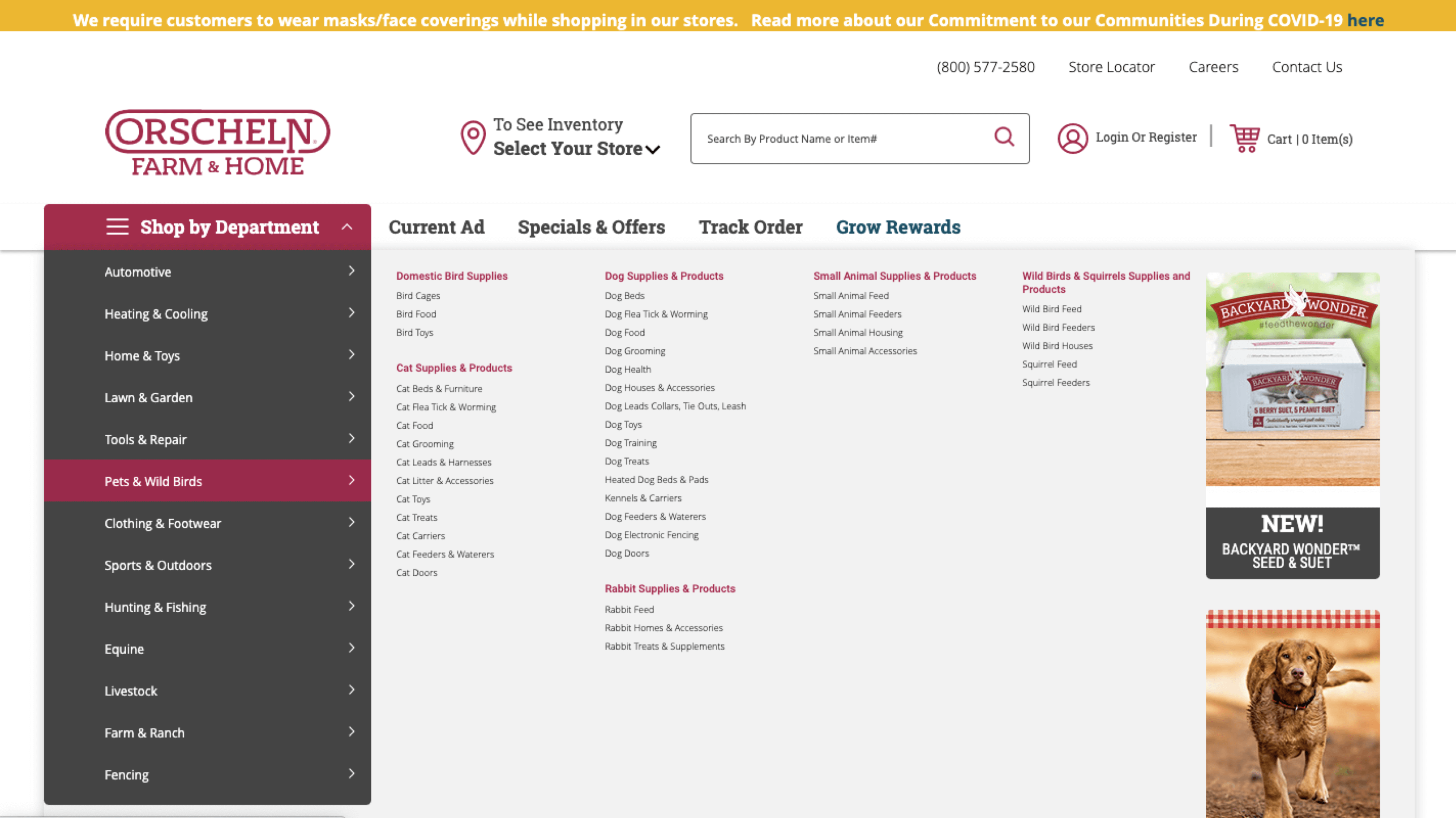
Your navigation should tell people what you do and showcase specific product types to make it as easy as possible to find what they are looking for in as few clicks as possible. A bonus to using more descriptive labels is the search engines crawling the header will immediately know what you do, which improves overall SEO (for example instead of ‘products’ use something for specific like ‘automotive parts’.
Notice how our client Orscheln Farm & Home uses descriptive navigation to help visitors quickly find exactly what they are looking for.
Tips to Create the Most Effective eCommerce Navigation
Our Echidnites have been studying, implementing, and measuring the effectiveness of eCommerce navigation for decades. Keeping up with current trends is just as important as utilizing best practices. A couple of important considerations to take into account include:
Update Sticky Navigation
Sticky navigation is described as locked navigation at the top of the screen when a user begins to scroll. However, users are finding that viewport space is too crowded with all these locked elements. Many sites are becoming smarter about introducing navigation, requiring users to either stop scrolling or start scrolling back up to view the navigation. These subtle nuances are by no means revolutionary, but they are very important to the sense of a site having “smart” interactivity.
Guest Viewability
Echidna believes that the navigation should be used to introduce functionality, even if it is NOT yet available to certain customer segments (to a guest or non-logged-in user, for example). We want to show links inside the header’s Account menu that describe what can be done (Quick Order, Reorder, Organization Management, Talk to an Agent, etc). If the user clicks on these options, then they will be introduced with the barrier (log in or sign up prompt). This allows them to learn the site’s capabilities and gain interest, which improves their likelihood of registering.
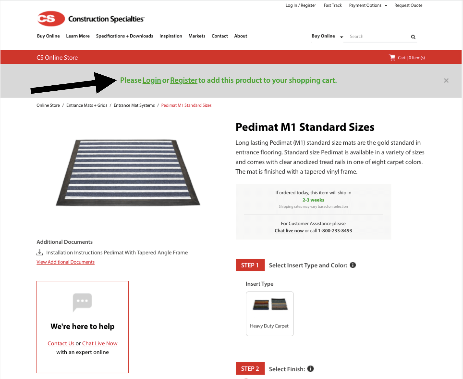
Our client Construction Specialties allows guest users to browse the site and products, requiring them only to log in when they want to add to the cart.
Mobile Navigation
With 52% of all online traffic now mobile, responsive/mobile-first design has become an absolute must. Mega menus or categorized sections can still be accomplished and easy to use if done correctly. Consider implementing expandable mobile navigation and utilizing the tray feature we mentioned earlier to optimize the top CTA’s (live chat, phone, cart).
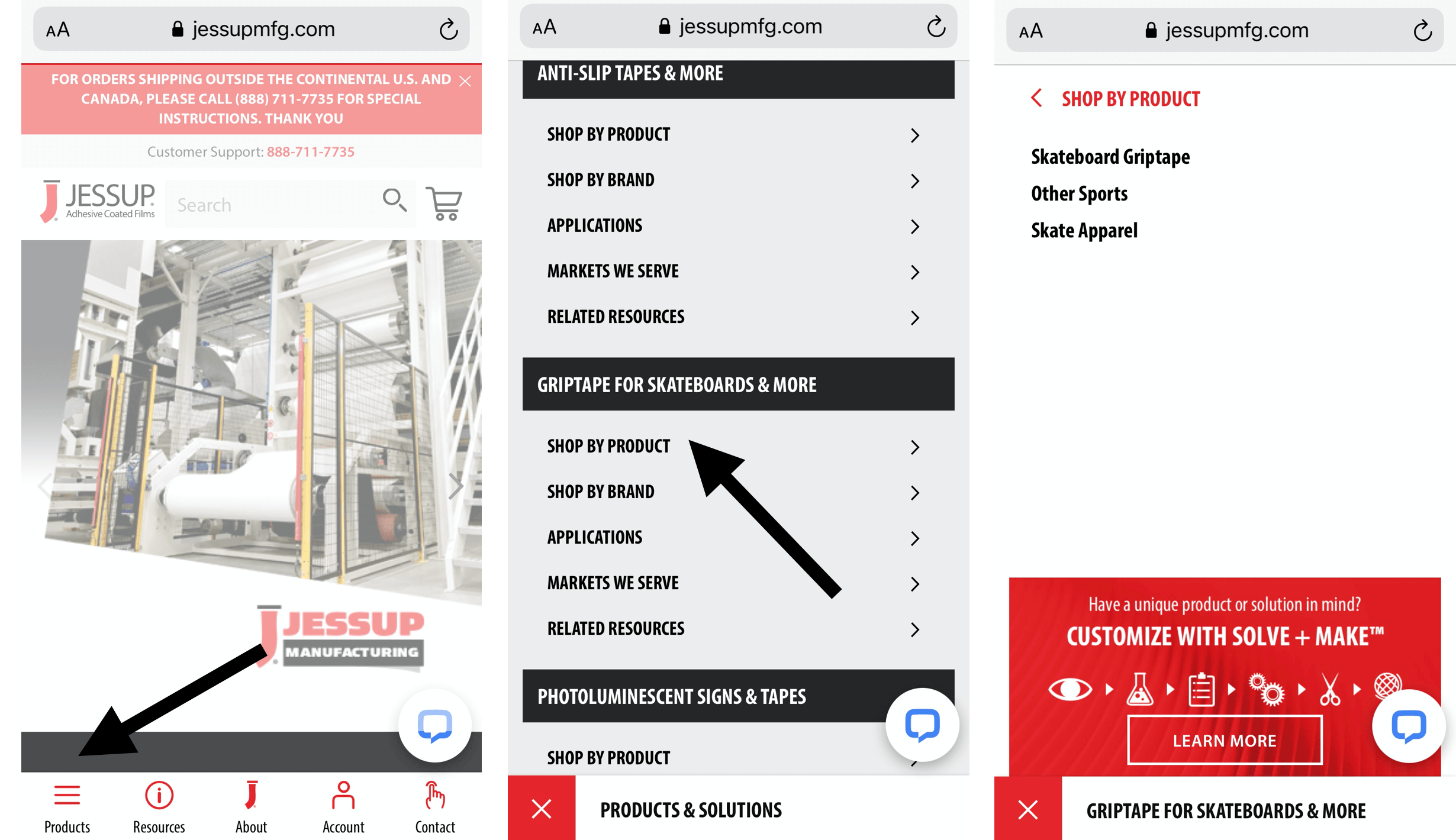
While our client Jessup Manufacturing has an extensive product line, using expandable mobile navigation and tray allows users quick access to what they are looking for.
Don’t Get Lost in Your Navigation
eCommerce navigation can be tricky. We didn’t even touch on footers, sidebars, and CTA navigation tactics in this article. The main thing to keep in mind is that you want to easily enable people to explore your site further and find what they need quickly. The navigation best practices we mentioned can be molded to fit your specific business needs in order to improve bounce rates, conversion rates, and transactions.
Wondering if your navigation is hindering your site performance? Consider our UX Site Audit which reviews your entire site, offering opportunities for optimization and improvement (without a full re-design!).
Echidna is a leading eCommerce agency with capabilities including strategy, user experience, marketing, systems integration, technology services, and managed services. Our goal continues to be to deliver top-notch quality on a predictable schedule and at an affordable rate that our clients recognize the real value in. We are dedicated to helping leaders continue with their growth and innovation well into the future.